Last week, we tackled the essentials of your Minimum Viable Brand: defining your audience, clarifying your promise, crafting your one-liner, telling your “why now” story, and choosing your brand voice.
Today, we’ll finish the job. Days 6–10 will take what you’ve built and turn it into a living, breathing foundation your team and users can rally around.
Let’s get into it.
Day 6–7: Build a Lightweight Visual Identity
Now it’s time to give your brand a visual "face"—something people can instantly recognize and trust.
Good news: you don’t need to retain an agency or invest in a fancy brand system yet. For now, all you need is the visual equivalent of a sharp outfit you’d wear to an important networking dinner—an appearance that says “we belong here.”
Here’s how to do it:
1. Choose a Clean, Flexible Typeface
Pick a professional, easy-to-read font for your brand’s primary typeface. You’ll use this typeface across as much of your key assets as possible; website, decks, materials, etc.
Good examples to start with include Inter, Satoshi, and Work Sans (all free and widely used).
👉 Pro tip: Use one font for headlines and body copy so your early materials stay clean and consistent.
2. Build a Minimal, Cohesive Color Palette
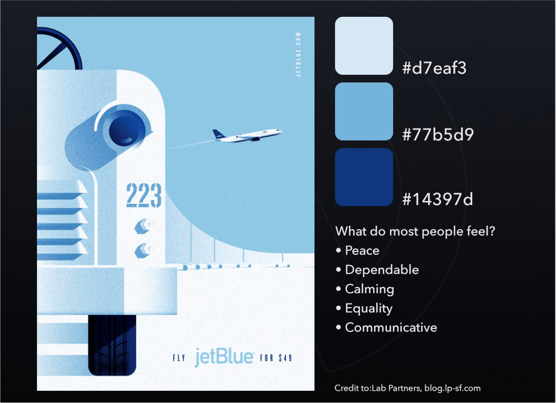
Select 2–3 core colors that reflect the feeling of your brand.
Try to select a color scheme that synergizes with your product category and “makes sense” for what you are offering.
For instance, if you’re building a finance tool, you might lean toward strong, trustworthy blues and greens. If you’re creating a wellness app, maybe softer, calming tans and neutrals will work. If you’re building a media brand, attention-grabbing colors like red or yellow may be suitable.
Use free tools like Coolors, Adobe Color or Canva’s Color Wheel to explore combinations that feel natural together (not clashing or overly loud).
👉 Pro tip: Pick one main color, one accent color, and one neutral (like dark gray or off-white) to keep it balanced.

Color is the first thing people feel when they see your brand. Start simple: one main color, one supporting accent, and one neutral tone for balance.
3. Create a Simple Logo or Wordmark
Your logo doesn’t need to be groundbreaking—it just needs to be clean, legible, and scalable.
Use tools like Figma, Looka, Canva or Coolors and even ChatGPT’s image generator to experiment with. Or use even just stylized text to start with (such as a “wordmark” like Google or Facebook).
Focus on simplicity and consistency: clear lines and no tiny details that will get lost when the logo is small.
If your logo is a wordmark and the full name doesn’t scale down in size well (e.g., for a social media profile pic or badge), consider making the first letter of the wordmark distinctive enough to stand alone—like Google’s “G,” Facebook’s “F,” or McDonald’s “M.”
Don’t overcomplicate things with mascots or overly stylized icons just yet. While some of the aforementioned graphics tools may offer tempting options, without the eye of a trained designer, you risk choosing something that feels generic—or worse, forced.
Create two to three basic logo variations: a full color version, a simplified version (for small sizes), and a monochrome (all black) or “knockout” version (all white). This gives you flexibility across different contexts without compromising brand consistency.
Remember: your logo isn’t necessarily permanent. Like the rest of your brand, it will likely evolve as your startup grows.
👉 Pro tip: Make sure your logo colors complement your overall palette, and that the logo looks strong both on light backgrounds and in a knockout version (white logo on a dark background).
4. Save Your First Style Guide
Once you have your font, colors, and logo locked in, create a simple “brand kit” document:
List your colors (with hex codes)
Show your logo in different sizes
Include font names and examples
Drop in a few mockups (e.g., simple web banners or slide templates)
Save it somewhere your whole team can access and use consistently.
Why it matters:
Early-stage users and investors will judge you (consciously or not) by how you look. You don’t need to be fancy—you just need to be intentional. A cohesive visual identity builds instant credibility and makes you look like you know what you’re doing.
👉 Pro tip: Use a tool like Webflow, Wix, or super.so to quickly build an on-brand site using your new assets.
A logo, cohesive color palette, complimentary fonts and synergistic accompanying visuals make up the core of your foundational visual brand assets.
Day 8: Tighten Your Website Messaging
What to do:
Take everything you’ve written—your promise, story, tone—and use it to draft:
Your website homepage headline + subhead
Short “about” blurb (1–2 sentences)
3–5 core benefits in bullet form
Boilerplate paragraph for decks or outreach
Why it matters:
Inconsistent or unclear messaging is one of the fastest ways to confuse potential users. Your goal isn’t to be clever—it’s to be unmistakably clear. When someone lands on your site or reads your pitch, they should immediately get what you do and why it matters.
On its home page, Brex’s business-first headline cuts through the noise, emphasizing speed and control in spending.
Day 9: Apply Your MVB Internally
Share your MVB doc with your team:
Review your core audience, promise, and tone together
Use it to align your design, growth, and comms efforts
Invite feedback—but don’t seek perfection
Why it matters:
Even in a team of five, clarity gets diluted fast. Your MVB gives everyone a shared foundation—so your brand shows up the same way in every user interaction, email, and tweet.
Day 10: Stress-Test It Externally
What to do:
Send your messaging (especially your one-liner and homepage draft) to 5–10 trusted people outside your team—ideally potential users or peers. Ask:
“What do you think this product does?”
“Who do you think it’s for?”
“Would you want to learn more?”
Look for gaps between what you think you’re saying and what people are actually seeing and hearing.
Why it matters:
You’re too close to your own product. External feedback reveals where your brand still feels vague, confusing, or generic. This is your final tightening loop before launch—or relaunch.
Wrap-Up: Keep It Moving
If you’ve gotten this far—congrats! You’ve got a functional, founder-built brand foundation—done in 10 days, without spinning your wheels or stalling your momentum.
Your Minimum Viable Brand doesn’t need to be pretty—it just needs to be clear. And remember: your MVB isn’t your forever brand. It’s a launchpad. It gives your story structure, your team clarity, and your users a reason to believe.
You’ll attract the right people. You’ll build trust faster. And you’ll spend less time reinventing the wheel every time you write a pitch, build a deck, or launch a new feature.
As your company evolves and grows, it will.
Until next week—stay scrappy, stay clear,
Best,
Edwin

