Become An AI Expert In Just 5 Minutes
If you’re a decision maker at your company, you need to be on the bleeding edge of, well, everything. But before you go signing up for seminars, conferences, lunch ‘n learns, and all that jazz, just know there’s a far better (and simpler) way: Subscribing to The Deep View.
This daily newsletter condenses everything you need to know about the latest and greatest AI developments into a 5-minute read. Squeeze it into your morning coffee break and before you know it, you’ll be an expert too.
Subscribe right here. It’s totally free, wildly informative, and trusted by 600,000+ readers at Google, Meta, Microsoft, and beyond.
It’s All In The Can
Water is not complicated.
It’s clear. It’s odorless. It’s tasteless. And it’s interchangeable.
Which makes it one of the hardest products in the world to brand.
Liquid Death looked at that problem and (smartly) decided not to compete on hydration.
It decided to compete on packaging.
And in doing so, turned a commodity into a cultural object.
The Insight: The Category Was Boring
Walk down the bottled water aisle. What do you see?
Blue labels. Images of mountain ranges. Words like “pure,” “natural,” and “refreshing.”
The category branding codes are predictable. And predictable categories create invisible brands.
Liquid Death didn’t tweak those codes.
It violated them.
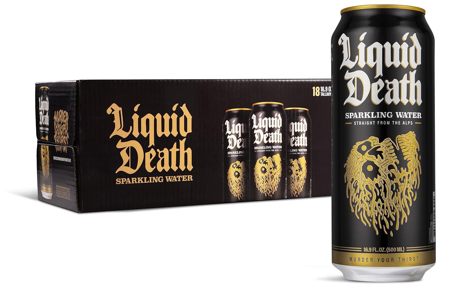
Tallboy aluminum cans. Gothic typography. A name that sounds like a metal band, not a hydration company.
It didn’t ask to be different. It insisted on it.

While competitors leaned on safe, familiar visuals, Liquid Death chose contrast—beer-style cans, bold typography, and a name you couldn’t ignore.
Packaging as Positioning
The can wasn’t a design decision.
It was a positioning decision.
By choosing tallboy cans, Liquid Death borrowed the visual language of beer and energy drinks. That instantly reframed water as something you could hold at a concert, a bar, or the gym without feeling like you were opting out. And it allowed others to instantly welcome you as “fitting in.”
The packaging actually solved a social problem, not a hydration one.
And because the packaging was so distinctive, the product became instantly recognizable from across a room.
That’s brand leverage.
Distribution Multiplied the Effect
Packaging only works if people see it.
Liquid Death leaned into placements where the can not only fit in seamlessly—it mattered:
Music festivals
Skate culture
Influencer-heavy social feeds
Convenience stores alongside beer
The product didn’t, and couldn’t, hide in the water aisle. It showed up where its packaging could create contrast.
Contrast drives attention. Attention drives trial.
Trial drives growth.

Contrast drives attention. Liquid Death put its cans where they stood out—music festivals, skate shops, and beer coolers—turning visibility into growth.
The Economics of Distinctiveness
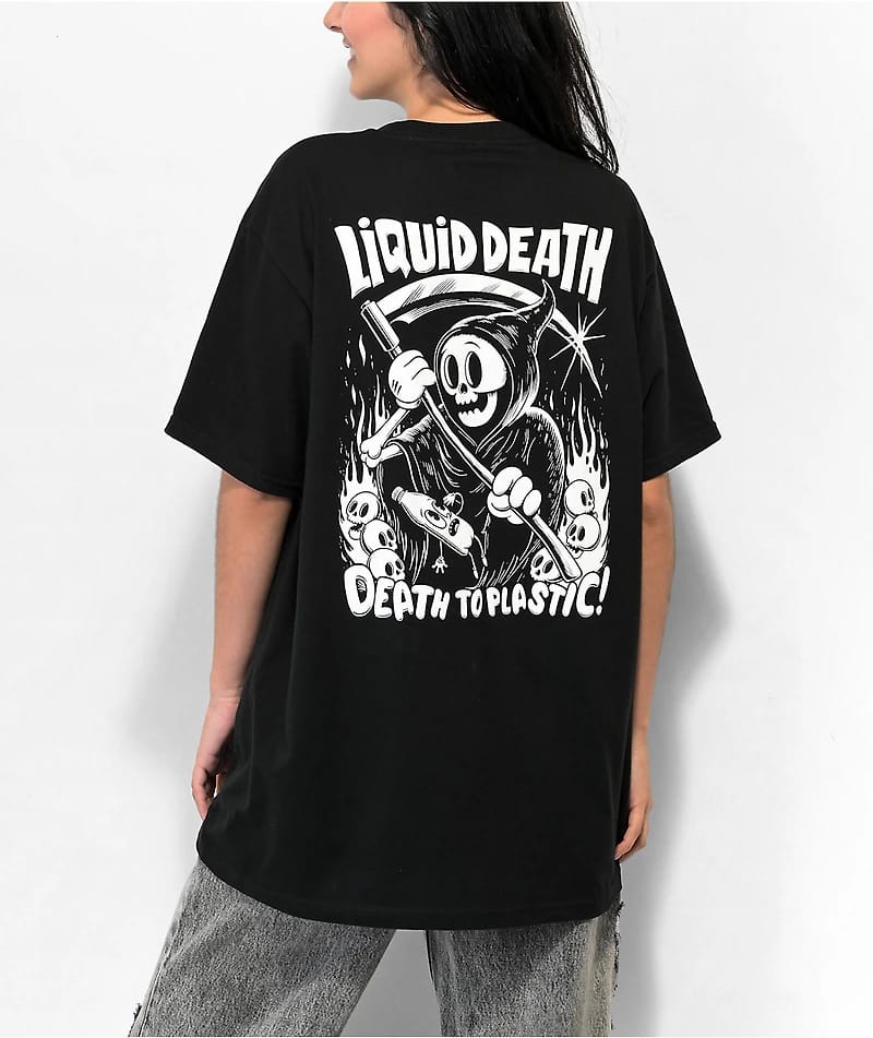
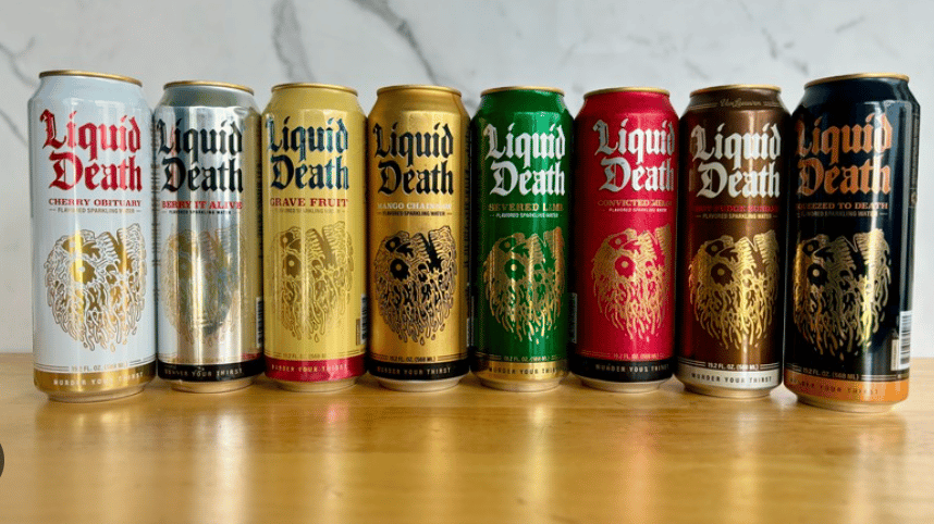
Liquid Death’s valuation has climbed into the hundreds of millions. It has expanded into flavored sparkling water, teas, and merch.
But the core asset hasn’t changed.
It’s still the can.
When your packaging is the brand, every touchpoint reinforces recognition:
Social posts
Retail shelves
User-generated content
Merchandise
The design does the marketing.
That reduces the need for constant reinvention.
The Genius of Commitment
The name “Liquid Death” is not safe.
It excludes people. It polarizes. It invites jokes.
But that’s the point.
Strong brands accept that distinctiveness requires tradeoffs.
If the product had been called “Mountain Stream Water” in the same can, the impact would have been diluted. If the name were bold but the packaging generic, it would have felt performative.
The power came from total alignment.
Packaging. Name. Tone. Distribution.
All reinforcing the same stance.

Liquid Death has expanded into new categories, like branded apparel and merchandise, and scaled its valuation in the process—but the core asset remains the can. When packaging is the brand, every shelf, post, and piece of merch reinforces recognition.
What Founders Can Steal From This
Even if you’re not selling beverages, the lesson holds.
1. Treat Packaging as Strategy, Not Decoration
Whether physical packaging or digital interface, design is positioning.
2. Break Category Codes Intentionally
If every competitor looks the same, small tweaks won’t matter. You need visible contrast.
3. Align Distribution With Identity
Your packaging should make sense in the environments where it appears.
4. Commit Fully
Half-bold brands don’t travel far. Liquid Death went all in.
Final Thought
In crowded markets, better is rarely visible.
Different is.
Liquid Death didn’t win because its water was superior. It won because it refused to look like water. It understood that in a commodity category, perception is the product.
When your packaging carries the story, your brand doesn’t have to shout. It just has to show up.
That’s the real lesson.
In a world where most startups tweak what already exists, the brands that break through are the ones willing to redesign the frame entirely.
Packaging isn’t surface.
It’s strategy you can hold in your hand.
Best,
Edwin


