“Aspirational” isn’t the word most people associate with the world of financial operations. Yet somehow over the past few years, Ramp, a next-gen spend management platform founded in 2019, made financial operations feel sharp, premium, and—dare I say it—desirable.
Ramp successfully cut through a landscape of outdated banks and bloated software by crafting a brand that signals sharpness, control, and contemporary design—all without the jargon and fluff normally associated with financial solutions.
Here are the steps Ramp took to build a standout brand in one of the most unglamorous corners of SaaS…and what early-stage founders can learn from it.

Since launching in 2019, Ramp has carefully crafted a sharp, modern brand that stands apart from the bloated legacy players it set out to replace.
Find out why 1M+ professionals read Superhuman AI daily.
In 2 years you will be working for AI
Or an AI will be working for you
Here's how you can future-proof yourself:
Join the Superhuman AI newsletter – read by 1M+ people at top companies
Master AI tools, tutorials, and news in just 3 minutes a day
Become 10X more productive using AI
Join 1,000,000+ pros at companies like Google, Meta, and Amazon that are using AI to get ahead.
1. Clarity Is the Goal
Ramp didn’t rely on clever headlines or invented categories. Their brand starts with a simple, confident promise:
“Save money and automate busywork.”
Everything else flows from that. Their product is laser-focused on efficiency, helping finance teams control spend, close books faster, and reduce overhead. The brand, which positioned itself as the modern corporate card and spend management platform from day one, delivers that same experience: tight, to the point, and without noise.
Where many startups over-explain or overcomplicate, Ramp respects your time. Its messaging is clear, direct, and refreshingly concise, especially in a category where legacy players often hide behind jargon and bloated copy. That clarity doesn’t just feel modern; it builds instant credibility.
Takeaway: Aspirational isn’t loud or verbose—it’s composed. Let your clarity do the talking.

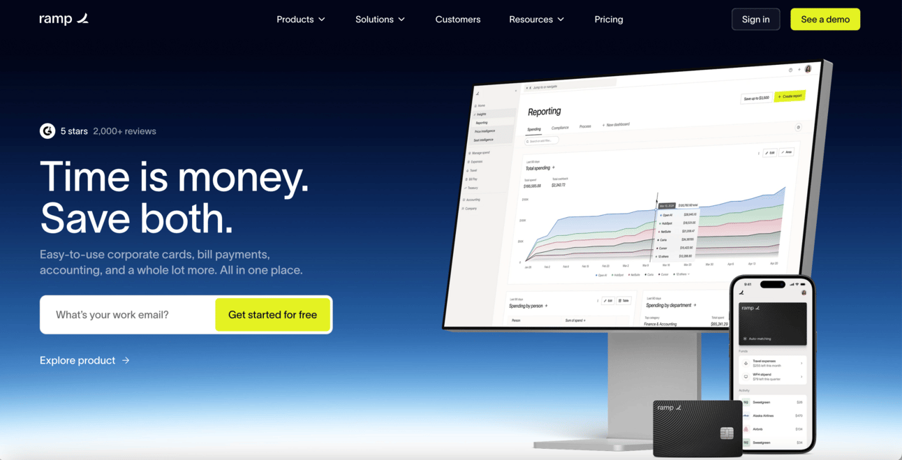
Ramp cuts through the noise with sharp, no-fluff messaging that earns trust by respecting your time. That same clarity is baked into its website—minimal, direct, and built for fast comprehension.
2. A Visual Identity That Reflects the Outcome
Ramp’s visual branding is clean, grayscale, and almost stark. No bright rainbow colors, mascots, or goofy illustrations. The tone is architectural: structured, intentional, and serious without being stiff.
This is exactly how the product wants you to feel—organized, in control, and a few steps ahead.
Too often, early-stage brands confuse “boring” with “professional” or “fun” with “trust-building.” Ramp shows that minimalist, restrained design—when done well—can feel premium, even aspirational.
Takeaway: Your visual identity should reflect the emotional value your product delivers. For Ramp, that’s clarity and control.
3. A Voice That Matches the User’s Mindset
Ramp doesn’t talk like a fintech startup trying to be your friend. It talks like a product that belongs in the hands of a high-performing team.
Their copy is functional, intelligent, and results-oriented:
“Control spend. Close books faster.”
“Built to save you time and money.”
“Finance that moves fast.”
This brand voice earns trust, especially when selling to Ramp’s target professionals. Streamlined. No hype. Just sharp, purposeful language.
Takeaway: You don’t need to force sounding “fun” to be approachable. And authority doesn’t require complexity. Speak to your user with respect and clarity, not razzle-dazzle.

As Ramp scaled, its direct yet approachable voice became a throughline across every touchpoint—from its website to its ad campaigns, both online and off.
4. Positioning With Discipline
Ramp didn’t try to reinvent the wheel. They entered an existing category—corporate cards—and immediately positioned themselves as a brand that embraced discipline:
“The only corporate card and spend management platform designed to help you spend less.”
While competitors offered perks and rewards, Ramp promised savings and automation, two tangible outcomes every finance team cares about. That strategic decision to focus on two all-important concepts shaped everything from their product roadmap to their messaging. It also created space to expand into bill pay, procurement, and beyond without losing focus.
Takeaway: Start narrow, choose a lane, own it with discipline and build out from there.
5. They Made Finance Feel Aspirational
Perhaps Ramp’s biggest branding win is this: they made a back-office tool feel like a modern luxury product. The design is sleek. The tone is confident. The product is fast.
More importantly, the entire experience—from onboarding to dashboard UX—feels frictionless and powerful. It evokes control, clarity, and operational sophistication. Ramp turned expense management into something a high-performing operator would be proud to use.
You also see it in the way they communicate: every word and visual is deliberate, pared down, and self-assured. No wasted space. No noise. Just the feeling that you’re using a tool built by people who get it.
Ramp doesn’t scream for attention. It signals, quietly but powerfully, that this is what high-functioning companies use.
Takeaway: Aspirational branding isn’t about surface-level polish; it’s about crafting an experience that mirrors your users’ mindset and highest ambitions. Ramp didn’t just design for finance teams. They designed for operators who demand speed, clarity, and excellence. And they nailed it.

In a space known for clunky tools and uninspired design, Ramp stood out by fusing elite product performance with the visual sophistication of a luxury brand—reframing finance as something to aspire to.
Final Thought—What You Can Steal (Respectfully)
Even if you’re in a “boring” category:
Don’t overcompensate. Simplicity and precision are more powerful than flash.
Lead with outcomes. Ramp promises time savings and cost control—nothing more and nothing less.
Design like it matters. Even in B2B, first impressions count…especially when selling to demanding professionals.
Remember: Your brand is more than your logo. It’s how people feel about your product—before they’ve even used it.
So, until next time, keep on building a brand that makes people feel something—something they want to be a part of.
Best,
Edwin


