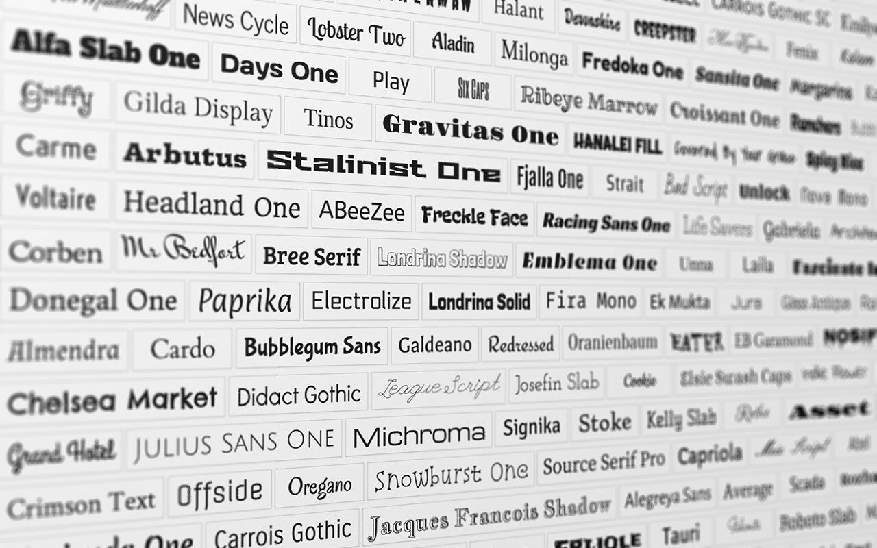
You’ve spent weeks perfecting your pitch. You’ve rewritten your headline twelve times. Your product solves a real problem. Your story is solid.
But before anyone even reads a word, they’re already feeling something about your brand—and it’s not good.
Based on what?
Your font.
Yep, typography is doing more heavy lifting than most founders realize. In the split-second it takes for someone to land on your site, open your deck, or glance at your product, your font choice is quietly telling them what kind of company you are, whether they should trust you, and what it feels like to interact with your product.
And like it or not, those impressions stick.
Fonts aren’t neutral—they speak volumes
Think of type as your brand’s tone of voice in visual form. A sharp serif feels classic and established. A rounded sans serif feels friendly and modern. A monospace typeface nods to code, precision, or developer culture. A script font might whisper elegance or, conversely, scream try-hard.
Whether you’re conscious of it or not, your font is part of your positioning. It sets expectations. It frames perception.
Let’s break down a few common examples:
Clean, geometric sans serifs (e.g., Inter, Satoshi, Circular):
These say: “We’re modern, accessible, product-led.” Think Notion, Figma, Airbnb.High-contrast serifs (e.g., Times Now, Tiempos):
These suggest: “We’re refined, editorial, high-trust.” Often used by media brands, premium DTCs, or startups playing in luxury/finance spaces.Rounded sans serifs (e.g., Quicksand, Nunito):
“We’re friendly, human, casual.” Great for wellness, consumer apps, and anything family-oriented.Monospaced fonts (e.g., IBM Plex Mono, Source Code Pro):
“We speak dev.” You’ll find these everywhere from docs tools to terminal-style landing pages.
Before you anchor in on a typeface for your brand, you don’t have to become an expert on font families—but you do need to be intentional. Because people feel fonts before they process your words. They register the vibe and make subconscious decisions: Do I trust this? Is this for me? Do they get me?
Inter, a clean sans serif font family, is a go-to for tech startups—it feels modern, accessible, and built for product-led brands.
The “vibe gap” problem
One of the biggest mistakes early-stage startups make is creating a mismatch between what they’re saying and how it looks.
You say you’re a bold disruptor—but your typeface is generic and conservative.
You say you’re trustworthy and premium—but your font feels like a Google Doc default.
You say you’re warm and human—but your typography is cold and mechanical.
This creates what we call a vibe gap—a disconnect between your message and the medium. And once that gap opens up, people don’t stick around to reconcile it. They just bounce.
The goal, therefore, is harmony. Your fonts, colors, copy, and layout should all work together to tell the same story. That’s when a brand feels coherent—and believable.
Don’t overthink it—just align
Choosing the right font isn’t about finding the most beautiful or striking one. It’s about finding one that aligns with your personality, your promise, and your audience.
Here’s a quick way to get started:
Know your brand attributes.
Are you bold or understated? Precise or playful? Minimal or expressive?Look at your category.
What’s expected in your space…and do you want to match it or intentionally break it?Test in context.
Put your font on your homepage, in your pitch deck, and inside your product. Does it feel right…and does it feel like you?Keep it simple.
Start with one primary font. Add one accent if needed (like a bold serif for headlines). That’s it. Complexity doesn’t equal sophistication—it often just confuses people.
Tools like Fontpair, Google Fonts, and Typewolf are great places to explore and test different pairings.
Resources like Typewolf can quickly provide a feel for how fonts can complement different offerings and what font pairings work well.
Final thought
Your startup might not have a full visual identity yet. You might even still be wireframing the product and testing positioning. That’s okay.
But even now—especially now—your font choice matters.
It’s one of the quickest, clearest ways to signal what your brand stands for. Before you’ve told your story, before you’ve explained your features, before you've even earned attention… your typeface is already talking.
Make sure it’s saying something worth listening to.
Best,
Edwin

