You’ve Hit Capacity. Now What?
You built your business by saying yes to everything. Every detail. Every deadline. Every late night.
But now? You’re leading less and managing more.
BELAY’s eBook Delegate to Elevate pulls from over a decade of experience helping thousands of founders and executives hand off work — without losing control. Learn how top leaders reclaim their time, ditch the burnout, and step back into the role only they can fill: visionary.
It’s not just about scaling. It’s about getting back to leading.
The ceiling you’re feeling? Optional.
Let’s get one thing straight:
When building a brand from scratch, good design is important.
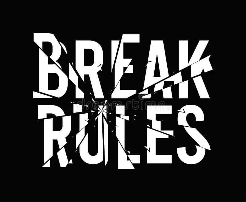
But great brands know a secret to design that sets them apart: they know when—and how—to break the rules.
In today's branding landscape, doing everything "right" often leads to a brand that feels algorithmically optimized—and instantly forgettable.
Safe fonts, predictable color palettes and templated UI? All clean. All correct. None memorable.
So what separates the brands that stick from the ones that are scrolled past?
They know which rules to break—and why.
The Risk of Blending In
When your brand plays it too safe, it starts to sound and look like everyone else. And that’s a problem. Because early-stage startups don’t win by following convention. They win by getting noticed—and remembered.
When a brand breaks expectations in a meaningful way, it creates emotional friction. And friction, especially with a meaningful payoff, sticks.
Brands That Knew When to Break the Rules
Here are some standout examples of brands that zigged when everyone else zagged—and made a lasting impression because of it:
✦ Public.com
In a category dominated by dull, uninspiring interfaces from incumbents (looking at you Fidelity and Schwab) or, increasingly dark, intimidating, high-frequency-trading vibes from new entrants (ahem, Robinhood and CashApp), Public leaned into a modern yet bright, editorial, and transparent aesthetic. Its interface looks more like a culture magazine than a stock trading app—and that difference was intentional. Public wanted investing to feel human and inclusive, not like an IRS form or a Vegas slot machine. Its app growing to over 3 million users in its first four years is a signal the strategy worked.
✦ Craigslist
Yes, it's ugly—circa mid-1990s ugly. Yes, it breaks every UI/UX “best practice.” But it’s also one of the longest-lasting, most profitable classifieds platforms on the internet. Why? Because it never pretended to be anything but utilitarian. And for 30 years, its only focus has been no frills local classifieds. Eventually, the janky design became part of the brand — and, over time, something its loyal users grew to expect and appreciate.
✦ Lush Cosmetics
While the beauty industry obsessed over sleek packaging and influencer-perfect visuals, Lush doubled down on imperfection. Handwritten labels, raw photography, and no-frills displays made the brand feel human, ethical, and refreshingly real. Their refusal to airbrush or overdesign became their signature aesthetic—and a signal of integrity.
✦ Supreme
When most streetwear brands flooded the market with loud stylized logo-dominant designs, Supreme did the opposite—it restricted access. And its simple red and white Helvetica logo broke the “unique identity” rule. But the uniformity, scarcity, and unapologetic minimalism became the design language. And inverting abundance into exclusivity made Supreme’s box logo one of the most recognizable marks in culture.

From the start, Supreme broke from mainstream sportswear by embracing minimalism and scarcity. That mix of restraint and exclusivity turned it into one of the most influential streetwear brands in culture.
So, When Should You Break the Rules?
Not every startup should go rogue. But rule-breaking is powerful when it’s strategic—not performative. Here’s how to do it well:
1. Upend The Clichés in Your Category
First, study your space. What are the visual or messaging tropes? Identify the common threads—and choose which ones to disrupt.
Example:
If every SaaS startup is leaning into corporate gradients and B2B jargon, maybe you build your brand like a DTC challenger instead—bold colors, sharp voice and human photography.
Action:
Run a quick audit of your top 5 category competitors. Highlight the overlaps—then intentionally differentiate.
2. Make a Bold First Impression—Then Deliver The Goods
Visual shock can grab attention. But the experience must justify it.
Example:
Email service provider Mailchimp had its early brand lean quirky: illustrated monkeys, offbeat copy, and unexpected animations. But their UX? Tight. Their onboarding? Smooth. It wasn’t weirdness for weirdness’ sake—it was personality paired with performance.
Action:
Ask: does our design serve a story? Or is it just different to be different? And does that take away at all from us delivering strongly on our core promise?
3. Break a Rule That Reinforces the Story
Design isn’t about aesthetics—it’s about narrative. Breaking design norms should reinforce the story your brand wants to tell.
Example:
A startup building tools for creative misfits might deliberately reject slick, polished design in favor of collage visuals and hand-drawn typography. It ends up not coming off as sloppy—instead, it comes off as aligned.
Action:
Write a 1-sentence story of your brand’s worldview. Then evaluate: does your current design reflect that story—or dilute it?
4. Use Restraint Strategically
Sometimes, breaking the rules doesn’t mean doing more—it means daring to do less.
In a world where most brands fight for attention through louder visuals and endless motion, a few choose the opposite: focus, calm, and quiet confidence. That restraint becomes their edge.
Example:
Apple has built its entire design philosophy on restraint. The company rejects cluttered visuals, complex copy, and even overt calls to action. The lack of noise—massive white space, minimal text, and slow, deliberate pacing—makes every detail feel intentional, premium, and human.
Action:
Look at where your brand might be over-communicating. Do your visuals scream when they could whisper? Could removing a design element—or even a word—make what’s left stronger?
5. Decide What You Want to Be Remembered For
No one remembers “neutral.” Design rules exist for consistency—but memorability often comes from the unexpected.
Example:
Old Spice went from outdated boring dad brand to viral sensation by leaning hard into absurdist humor and over-the-top visuals. It turned out to be a calculated left-turn that transformed the brand.
Action:
What’s one thing your brand could be the most of in your category? Lean into it—even if it means breaking a rule.

Mailchimp’s offbeat tone and chimp mascot helped it break through the SaaS noise early on—earning loyalty by balancing playful branding with dependable results.
Final Thought
Startups often think good branding through design means doing everything “right.”
But the brands people talk about?
The ones they screenshot, share, and remember?
They’re the ones that did at least one thing deliberately wrong.
So yes, learn the rules.
Respect the craft.
But then—when it matters most—be brave enough to bend a few.
Because sameness is safe.
But surprise is sticky.
And branding, above all else, is the art of being unforgettable.
Until next time—
Break from the norm. Design with guts.
Best,
Edwin


